Button
Guidelines: Accessibility Label, Accessibility Role, Accessibility State
For any component that leads to an internal screen, the button accessibility role should be used.

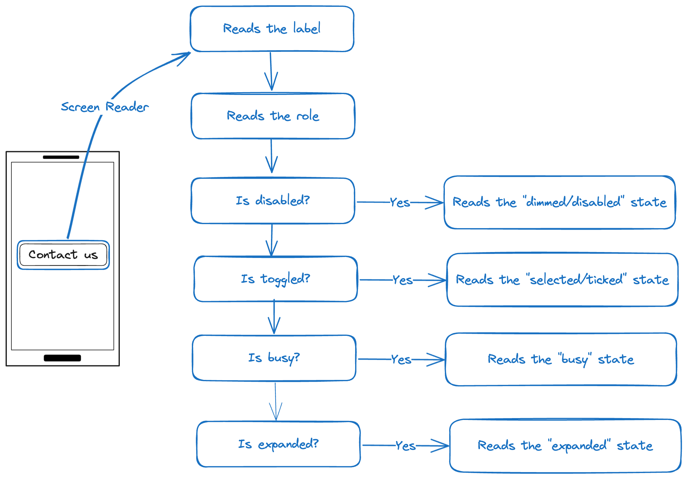
| Screen Reader | I hear |
|---|---|
| Label | Purpose is clear matches visible label |
| Role | button |
| State | See table below |
| State1 | When state is true, I hear | When state is false, I hear |
|---|---|---|
| busy | busy | |
| expanded | expanded | collapsed |
| disabled | disabled | |
| toggled | checked (iOS), ticked (Android) | not checked (iOS), not ticked (Android) |
Testing
Procedures
- Turn on a Screen Reader.
- Move focus to the button.
- Evaluate whether the label adequately and uniquely describes the component and clearly communicates its function.
- Verify whether the active state is announced appropriately.
Outcome
Ensure all the following checks are true:
- The label is clear and understandable.
- The component is announced as a "button" by the screen reader.
- Any state of the component, such as ticked, disabled, etc., is announced by the screen reader.
Example
| VoiceOver | Talkback | |
|---|---|---|
| Contact us, button, double tap to activate | Contact us, button, double tap to activate | Good |
Footnotes
-
In some cases, Talkback announces the accessibility state before the label. ↩